1. Typography – the art of arranging or designing type or processing data and printing from it

- Cap Height – the height of a capital letter above the baseline for a particular typeface

- Baseline – the imaginary line upon which a line of text rests

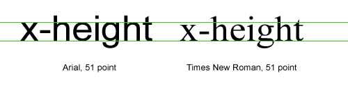
- X-Height – the distance between the baseline of a line of type and tops of the main body of lower case letters (i.e. excluding ascenders or descenders)
- Ascender – the upward vertical stem on some lowercase letters, such as h and b, that extends above the x-height

- Descender – The portion of some lowercase letters, such as g and y, that extends or descends below the baseline

- Kerning – the process of adjusting the spacing between characters in a proportional font, usually to achieve a visually pleasing result.

- Leading – the distance between the baselines of successive lines of type

- Serif – semi-structural details on the ends of some of the strokes that make up letters and symbols

- Sans Serif – one that does not have the small projecting features called “serifs” at the end of strokes. The term comes from the French wordsans, meaning “without”.


