So, I’ve officially finished my very first typography design. This is it (top)! I rather like the design, although it is only in black and white versus my originally intended spectrum of colors.

I am a bit sad that I was unable to incorporate more hues, but I made that sacrifice for the added boldness of my design. The white-on-black portion of my design honestly looked a bit silly and out of place whenever I tried to add a light green background behind the whole thing, so I figured doing this was for the best. At least I used the black from my designated spectrum :p Also, you may notice the giant triangle in the typography. This isn’t just any ol’ random triangle–it’s featured as a tribute of sorts to the band Δ (alt-J) who provided the very lyrics for this project. They commonly use a similar graphic for their logo (top), but I changed it a little (bottom) so as to have a bit of originality and not plagiarize. c;
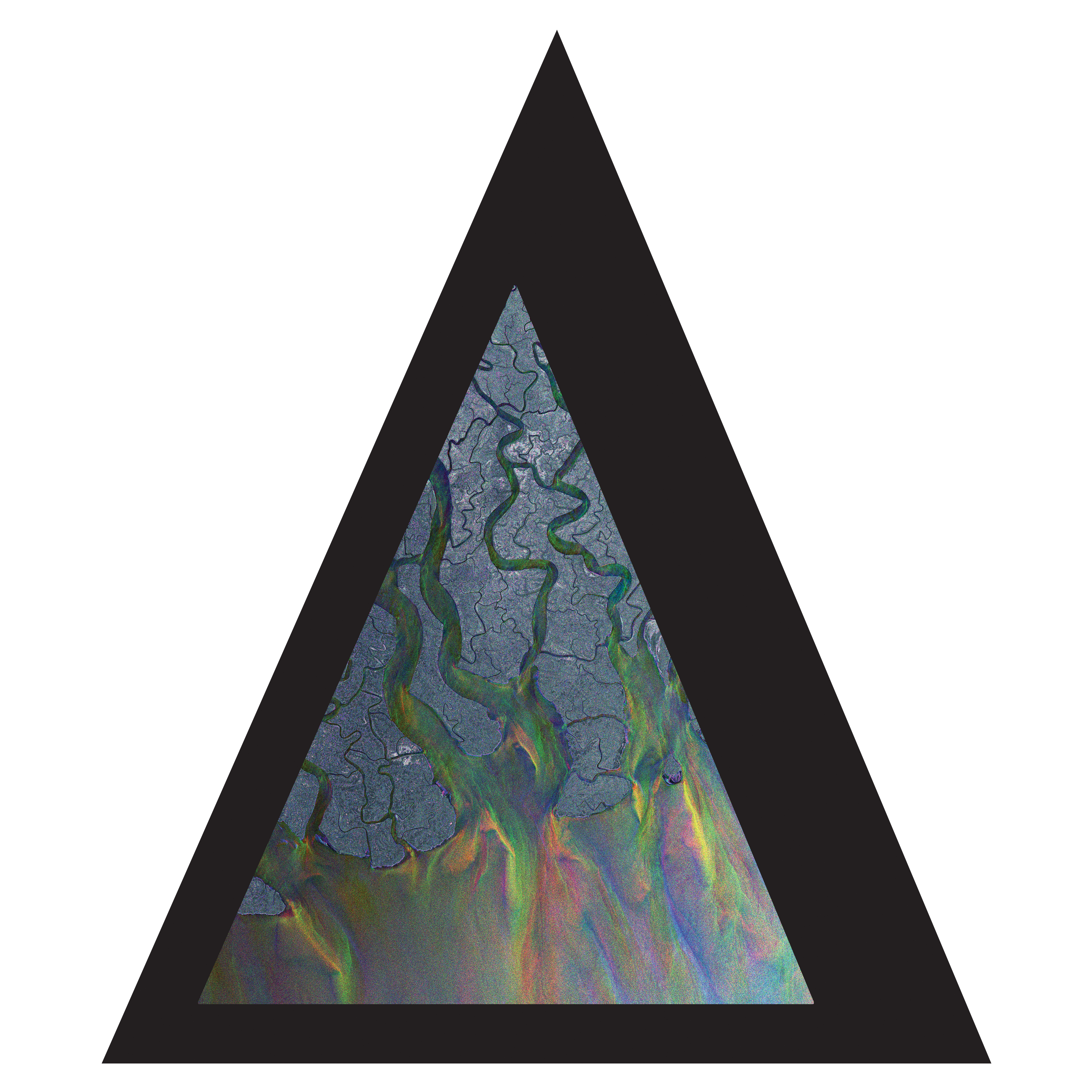

See? Very similar, except it works better with my design, and I shan’t be sued c:
